Gnome3rendering
I don't know how to make Gnome3 (Scientific Linux 7.7, like CentOS 7.7) produce sharply defined letters in gnome-terminal or mate-terminal or ...
I'm used to Scientific Linux 6.10 (like CentOS 6.10) with gnome2, which produces easier-to-read, properly-proportioned text on my old 1024x768 thinkpad X61s.
And I prefer 4x3 format screens or taller; I write and read vertically formatted scientific papers and similar documents, not videos and tweets. Newer "runt" screens may be cheaper to make, but don't help me do my job; my eyes are old and I can't see smaller pixels.
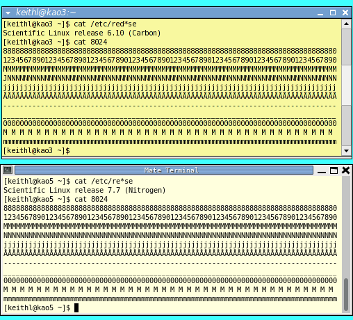
Here's a comparison of two xterms, and an image of 100 lines (200x200 px) made with gimp (in SL7) for comparison:


Compare the sharp pixels above to the foggy terminal below. My old eyes are already foggy and do not need extra defocusing. Those are window captures combined with GIMP.
I've tried many alternate terminal programs (xfce-terminal, qterminal, etc.) on SL7. They all render the text the same foggy way. The underlying font rendering software is the problem, not the terminal program nor the display code.
My SL7 desktop (with two vertically-oriented 1024x1280 screens) uses Fixed Regular 14 font at 96 dpi. The characters are still fuzzy at the edges, but they are large enough to show some contrast. Not great, but acceptable.
My question: which software module renders the characters into pixels? Bonus question, what portion of the source code can be repaired or bypassed to get rid of the fuzz (which I presume is a failed attempt at antialiasing for dodopaddle screens).
Details
In both cases, the terminal uses "Bitstream Vera Sans Mono Roman 7" font. In both cases, the appearance is
- Subpixel smoothing (LCDs)
- Details:
- Resolution: 106 dots per inch
- Smoothing: Subpixel (LCDs)
- Hinting: Full
- Subpixel Order: RGB
My 9.66 inch wide, 1024 pixel wide X61 laptop screen is 106 dpi. Some other values besides 106 dots per inch (with appropriate font sizes) seem to work the same way.
For the SL7 laptop, I've spent hours trying different combinations. Besides MATE, I see the same font behavior with GNOME, GNOME Classic, and Xfce Session. On my beloved X61 laptops, CPU, RAM, and pixels are precious commodities; I don't need animation and eye candy to waste my time and resources.
Should I just stick to SL6 forever on the small laptops, and accept the security risk of not upgrading software? What about web browsers; the same "continuous upgrade for full programmer employment" behavior seems to apply to some websites.