|
⇤ ← Revision 1 as of 2020-01-03 00:21:01
Size: 481
Comment:
|
Size: 515
Comment:
|
| Deletions are marked like this. | Additions are marked like this. |
| Line 4: | Line 4: |
| I'm used to Scientific Linux 6.13 which produces easier-to-read, properly-proportioned text on my old 1024x768 thinkpad X61s. |
I'm used to Scientific Linux 6.10 (like CentOS 6.10) with gnome2, which produces easier-to-read, properly-proportioned text on my old 1024x768 thinkpad X61s. |
Gnome3rendering
I don't know how to make Gnome3 produce sharply defined letters in gnome-terminal or mate-terminal or ...
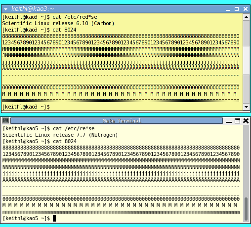
I'm used to Scientific Linux 6.10 (like CentOS 6.10) with gnome2, which produces easier-to-read, properly-proportioned text on my old 1024x768 thinkpad X61s.
And I prefer 4x3 format screens or taller; I write and read vertically formatted scientific papers and similar documents, not videos and tweets.
Here's a comparison of two xterms:

