|
Size: 1126
Comment:
|
Size: 1151
Comment:
|
| Deletions are marked like this. | Additions are marked like this. |
| Line 15: | Line 15: |
| I've tried many alternate terminal programs (xfce-terminal, qterminal, etc.) on SL7. They all render the text the same foggy way. The underlying rendering font engine is the problem, not the terminal program. | I've tried many alternate terminal programs (xfce-terminal, qterminal, etc.) on SL7. They all render the text the same foggy way. The underlying '''font rendering code''' is the problem, not the terminal program nor the display code. |
Gnome3rendering
I don't know how to make Gnome3 (Scientific Linux 7.7, like CentOS 7.7) produce sharply defined letters in gnome-terminal or mate-terminal or ...
I'm used to Scientific Linux 6.10 (like CentOS 6.10) with gnome2, which produces easier-to-read, properly-proportioned text on my old 1024x768 thinkpad X61s.
And I prefer 4x3 format screens or taller; I write and read vertically formatted scientific papers and similar documents, not videos and tweets. Newer "runt" screens may be cheaper to make, but don't help me do my job; my eyes are old and I can't see smaller pixels.
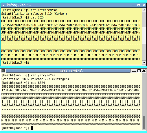
Here's a comparison of two xterms, and an image of 100 lines (200x200 px) made with gimp (in SL7) for comparison:


Compare the sharp pixels above to the foggy terminal below. My old eyes are already foggy and do not need extra defocusing.
I've tried many alternate terminal programs (xfce-terminal, qterminal, etc.) on SL7. They all render the text the same foggy way. The underlying font rendering code is the problem, not the terminal program nor the display code.
